Creating Beautiful Twitter Graphs
Want to learn two useful Python packages? Want to visualize everyone who doesn’t follow you back on Twitter in one bitter and pathetic graph? Read on.
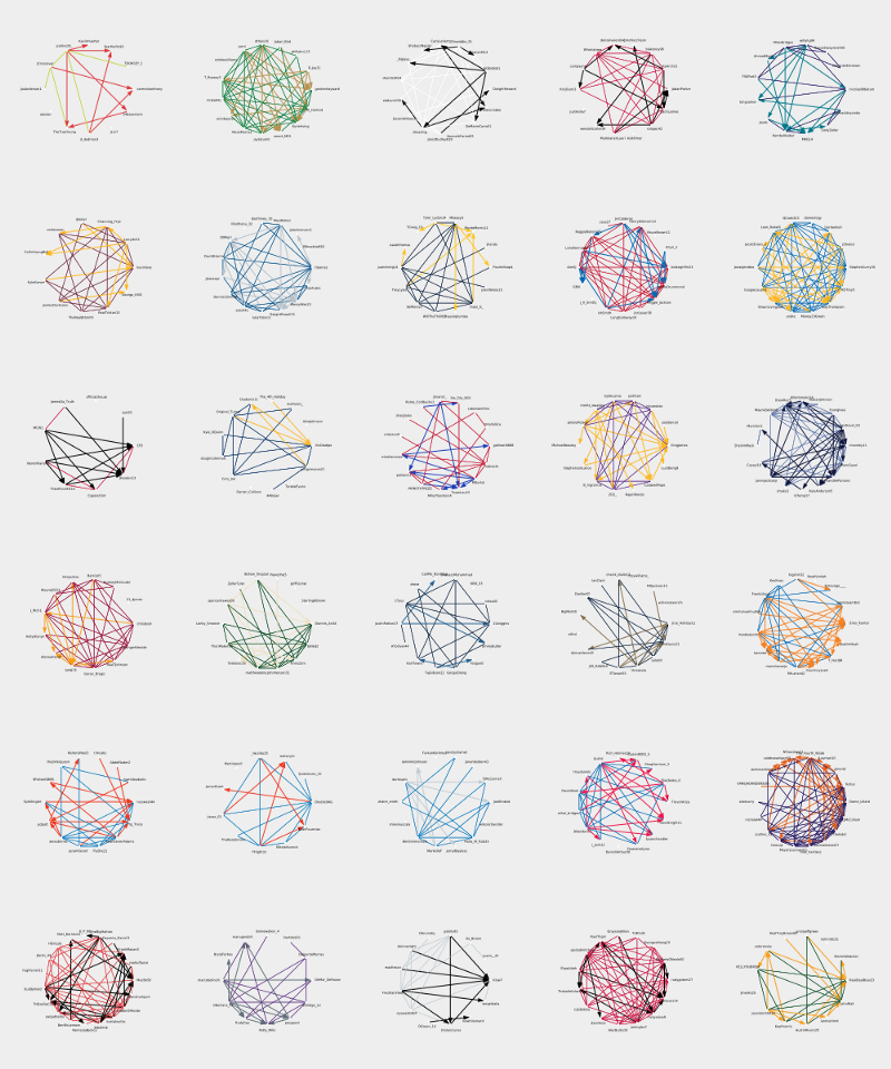
Graphs in the computer science world are a collection of vertices and edges, rather than a bar graph or a scatter-plot — but you knew that already. Graphs are powerful tools that have the potential to communicate complex relationships visually. Plus, they can be pretty. Why not see what relationships we can deduce from Twitter?
Data collection
Twitter already has a Python wrapper for its Application Protocol Interface (API), python-twitter, so we don’t have to make HTTP requests and parse the responses ourselves. We can let the wrapper do that for us. We will have to create app-credentials through Twitter in order to use the API however. Follow python-twitter’s docs in order to do so. All you need is a Twitter account, no special privileges necessary.
With credentials in hand we can create an instance of the Twitter API.
import twitter

# Add your tokens to get an API instance
api = twitter.Api(consumer_key="",
                  consumer_secret="",
                  access_token_key="",
                  access_token_secret="")
api.sleep_on_rate_limit = True
I am an NBA fan so the graphs I was interested in creating were of player-to-player connections on Twitter. This is a fun dataset because the league has a very active social media presence. There are also easily obtainable attributes per player, such as contract size, team, and position. You could follow the same steps for whatever group of Twitter users you’re interested in, whether it be celebrity chefs, musical artists, or meme account reply-guys.
There are 30 NBA teams with around 15 players each. I wasn’t keen on manually looking up 450 Twitter handles to feed them into the API, espescially if I could do it programmatically. Basketball-reference.com came to my rescue, where I found a table of all the current players under contract.
Armed with this list of player names I used the API to search for corresponding Twitter-ids, and bundled player attributes together into a vertext list named V. If you already had a list of screen names, or even better Twitter-ids, this would be redundant. In case you don’t, here’s the code:
# returns twitter user obj after searching for str name
def getUserFromName(name, api):
    user_list = api.GetUsersSearch(term=name, page=1, count=1)
    if user_list:
        user = user_list[0]
        if user.verified:
            return user
    return None

# queries =
# [["Stephen Curry", "GSW", "$37,457,154", ...],
#  ["Chris Paul", "HOU", "$35,654,150", ......],
#                                        .....]]
V = []
for i in range(len(queries)):
    user = getUserFromName(queries[i][0], api)
    if user:
        row = [repr(user.id), user.name, user.screen_name]
        for attribute in queries[i][1:]:
            row.append(attribute)
    V.append(row)
After that processessing V is a list-of-lists, which I dumped as a Comma Separated Value (CSV) file with the following columns:
| TWITTER_ID | USER_NAME | SCREEN_NAME | TEAM |
|---|---|---|---|
| 42562446 | Stephen Curry | StephenCurry30 | GSW |
| 53853197 | Chris Paul | CP3 | HOU |
| 23083404 | LeBron James | KingJames | LAL |
I knew I was looking for high-profile athletes so I only included users that were verified in my search. I also assumed the first result from the search
was always the correct one - which was pretty close but not always true. Finally, I iterated over V and used the GetFriendIDs() API call to find friends of each Twitter-id. A friend is a person a user is following. If the friend was in V I output this edge to another CSV file, creating an edge list.
| FOLLOWING_ID | FOLLOWED_ID |
|---|---|
| 42562446 | 53643297 |
| 42562446 | 59297233 |
Now that we have vertices and edges we are ready to do some visualization!
Visualization with igraph
At this point you could just load your vertext and edge list into your favorite graph plotting software and go from there… but that wouldn’t be any fun. Let’s see what we can do sticking to Python.
Python-igraph was my package of choice. I found it easiest to install with Python 2.7 and easiest to use inside a Jupyter Notebook.
Let’s make a graph from our vertices and edges, I’ll only include the top 10 highest paid players.
from igraph import *

#this info read in from our .csv files
E          = [("42562446","53643297"), ("42562446","59297233"),...]
V          = ["42562446", "53853197", "23083404",...]
user_names = ["Stephen Curry", "Chris Paul", "LeBron James",...]
scrn_names = ["StephenCurry30", "CP3", "KingJames",...]

g = Graph(directed=True)
g.add_vertices(V)
g.add_edges(E)
plot(g)
That plot(g) would produce this beauty:
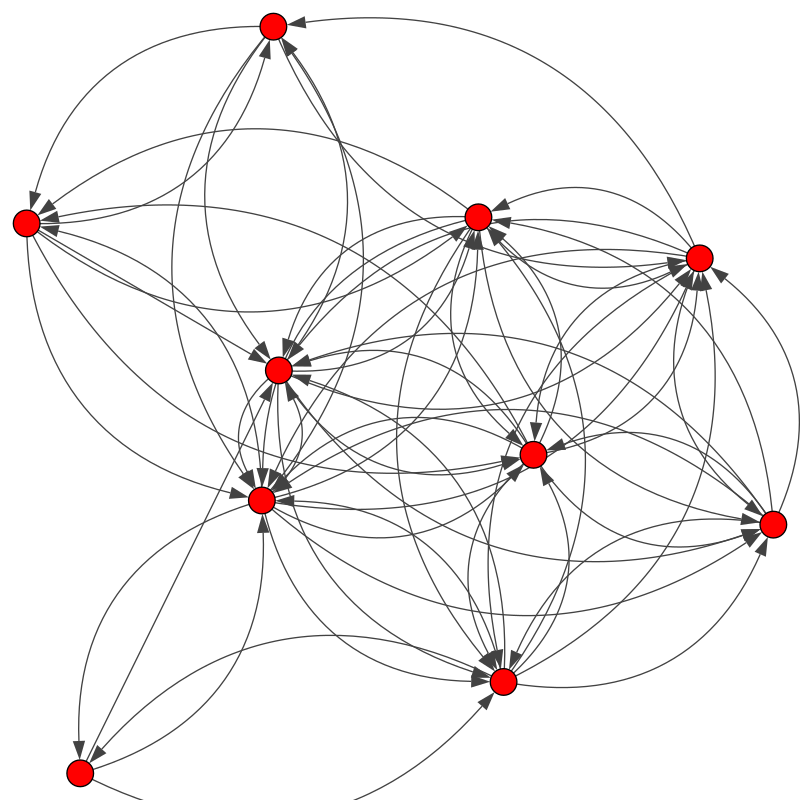
Oh my, that’s pretty gross! What vertex is what Twitter user? Why is it hairy looking??
Don’t worry, styling can fix all of this.
First I wanted to add labels. Then I wanted to straighten our the hairball by removing curved edges, and adding a margin to prevent edges from
drifting outside the bounding box. We’ll keep our styling options in a dictionary called style so we can reuse it later.
#add vertex attributes
g.vs["screen_name"] = scrn_names
g.vs["user_name"] = user_names

style = {}
style["edge_curved"] = False
style["margin"] = 100
style["vertex_label"] = g.vs["user_name"]
plot(g, **style)
The .vs member of the graph associates an attribute with the vertices, mapped in the order the vertices were added. Since our user_name and scrn_name arrays are in the same order as V, this is pretty easy.
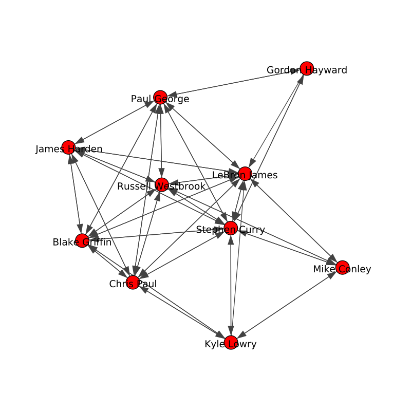
This looks a lot better. However, one of my initial goals for the visualization was to efficiently communicate what a follow was versus a follow-and-a-follow-back. With igraph it is easy to iterate over edges and detect these two cases, and style them accordingly.
for e in g.es:
    src, targ = e.tuple
    if g.are_connected(targ, src):
        e["color"] = "green"           #follow + followback
        e["arrow_size"] = 0
    else:
        e["color"] = "blue"            #follow
        e["arrow_size"] = 1
plot(g, **style)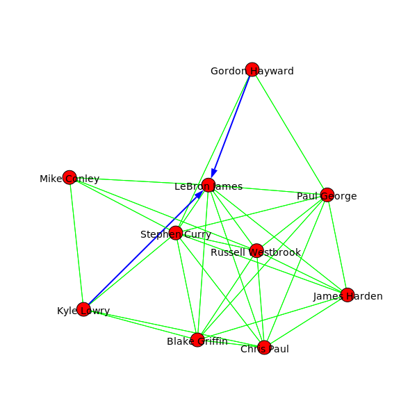
Well there you have it folks, LeBron has left Kyle Lowry of the Toronto Raptors and Gordon Hayward of the Boston Celtics hanging. Come on LeBron!
From here you could style the vertices so they don’t conflict as much with the labels, adjust the label distance from the vertices, experiment with different layouts (how the graph is structured), and more. I’d suggest saving your plot as an Scalale Vector Graphic (SVG) file so you can get your labels or vertices arranged exactly right with an SVG capable editor like Inkscape, Sketch, or Photoshop.
The 30 NBA team graphs shown from the beginning of this article used a circular graph layout with colors from each team’s official palette. Here’s the one for my favorite team, the Golden State Warriors, up close:
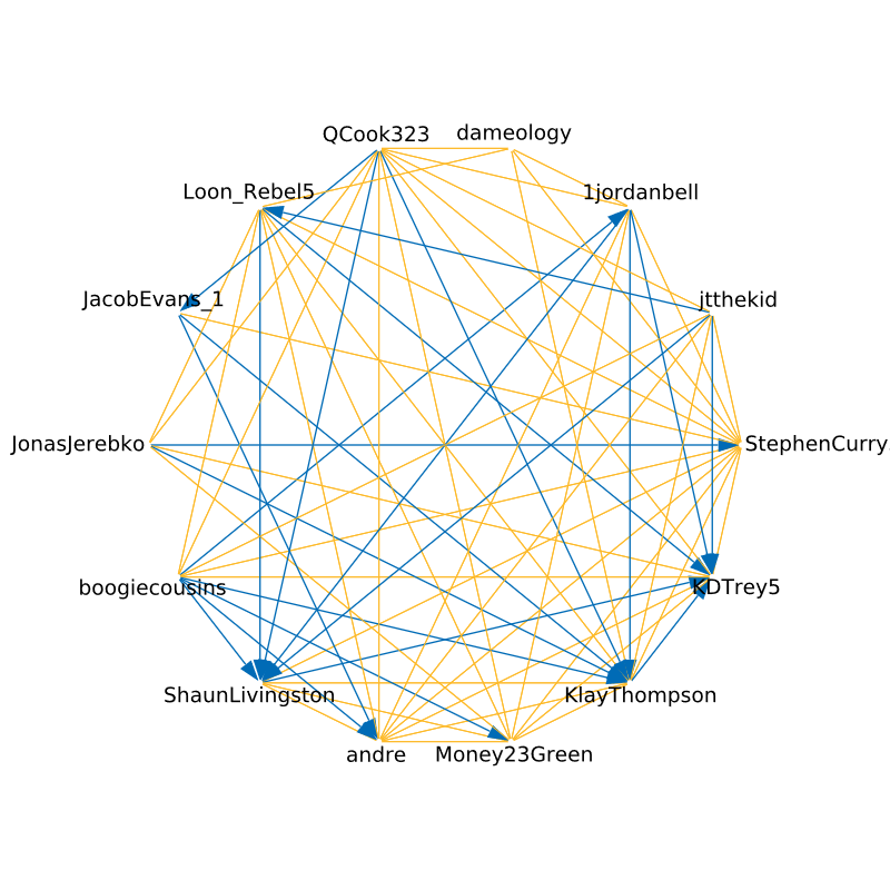
Not only is it nice to look at, but it does give us some insight to the relationships between players. Curry and Draymond are the leaders of the team, they follow everyone back. Thompson, Durant, and Livingston appear to be more aloof. Demarcus Cousins, a recent addition, has already made an effort to connect with his teammates. Well, that or he already followed them.
From here you could experiment with graph algorithms to try and answer questions like:
- What player in the NBA is the most central?
- Who has the best followers to following ratio?
- What cliques exist in the NBA?
- What team is the most connected, which team is the least?
You can find my repository of this project at kublasean/nba-twitter-analysis.